Workshop designed by Emily Molfe
Good Cheat Sheet: http://www.maths.lancs.ac.uk/~rowlings/Teaching/UseR2012/cheatsheet.html
Source for some exercises: https://rpubs.com/cengel248/59418
Load Libraries
library(maps)  # For creating geographical maps
library(mapdata)  # Contains basic data for ’maps’
library(maptools)  # Tools for handling spatial objects
library(mapproj)  # For creating projected maps
library(raster)  # Tools to deal with raster maps
library(ggplot2)  # To create maps
library(gpclib)  # general polygon clipper
library(RColorBrewer)  # Color packes
library(classInt)  # Choose univariate class intervals
library(acs)  # Package to handle ACS data
library(choroplethr)  # Simplify the creation of Choropleth Maps in R
library(rgdal)  # Bindings for the Geospatial Data Abstraction
library(sp)  # Classes and mehods for spatial data
library(hexbin)  # Hexagonal Binning Routines
library(ggmap)  # Google maps and OpenStreetMap
library(XML)  # Tools for parsing and generating XL
library(dplyr)  # Data Manipulation
library(rgeos)
Example 1: Arlington
Load data
Single Point in Arlington
# Example 1: Arlington
# -----------------------------------------------------------------------

# Load Data ---------------------------------------------------------------

# County shapfiles come from: http://gisdata.arlgis.opendata.arcgis.com/

# Arlington County Border loads shape file
Ar <- readShapePoly("Data/County Line/Arlington_Boundaries_and_Facilities.shp")

# projects the data make sure that all your objects are on the same
# projection
proj4string(Ar) <- CRS("+proj=longlat +datum=NAD83")

# Roads
Roads <- readShapeLines("Data/Roads/Roads.shp")

# VT Building (plotting 1 point)
VT <- as.data.frame(cbind(-77.116258, 38.88143))

# Change col names to pinpoint x and y
colnames(VT) <- c("x", "y")

# Make into coordinates
coordinates(VT) <- ~x + y

# Project the VT data
proj4string(VT) <- CRS("+proj=longlat +datum=NAD83")
Get census block group
# Census Blocks read the projection into the polygon in 1 step
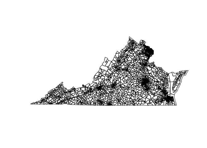
geodat <- readShapePoly("Data/Block Group/tl_2014_51_bg.shp", proj4string = CRS("+proj=longlat +datum=NAD83"))
Plot Virginia
# Plot to check
plot(geodat)
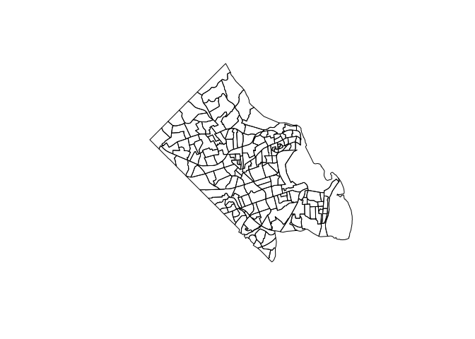
# Get Block Groups for Arlington County Only
geodat <- geodat[which(geodat$COUNTYFP == "013"), ]

# Order block groups to help data merging
geodat <- geodat[order(geodat$GEOID), ]
Plot Arlington
# Plot to check
plot(geodat)

ACS Data
# Load ACS Data
myacs <- read.acs("Data/ACS SNAP/ACS_13_5YR_B22010_with_ann.csv", geocols = 3:1,
    endyear = 2013)

# See column names
myacs@acs.colnames
[1] "HD01_VD01.Estimate; Total:"
[2] "HD01_VD02.Estimate; Household received Food Stamps/SNAP in the past 12 months:"
[3] "HD01_VD03.Estimate; Household received Food Stamps/SNAP in the past 12 months: - Households with 1 or more persons with a disability"
[4] "HD01_VD04.Estimate; Household received Food Stamps/SNAP in the past 12 months: - Households with no persons with a disability"
[5] "HD01_VD05.Estimate; Household did not receive Food Stamps/SNAP in the past 12 months:"
[6] "HD01_VD06.Estimate; Household did not receive Food Stamps/SNAP in the past 12 months: - Households with 1 or more persons with a disability"
[7] "HD01_VD07.Estimate; Household did not receive Food Stamps/SNAP in the past 12 months: - Households with no persons with a disability"
# Pull out columns of interest
snapt <- myacs@estimate[, 1]  # Total
snap <- myacs@estimate[, 2]  #  Household received Food Stamps/SNAP in the past 12 months

# Extracts attribute data from shape file
mdat <- geodat@data

# Binds ACS data to attributes (previous ordering makes this easy)
mdat <- cbind(mdat, snap, snapt)

# Connect attributes back to shapefile
geodat@data <- mdat
plot(geodat)
Need to tell it to plot with specific variables and colors
# General Plot to map SNAP
# --------------------------------------------------------------------
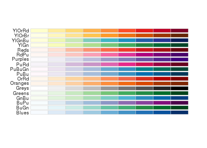
# Decide on colors from brewer.pal
display.brewer.all(type = "seq")
# Set Colors
nclr <- 4  # number of breaks for colors and legend
plotclr <- brewer.pal(nclr, "Reds")  # palette from brewer

# Set breaks for different colors (... can use quantiles too with quantile()
# command
class <- classIntervals(geodat$snap, nclr, style = "fixed", fixedBreaks = c(0,
    20, 50, 75, 100, 300))

# Set colors
colcode <- findColours(class, plotclr)

# Check names of breaks to set names
names(attr(colcode, "table"))
[1] "[0,20)" "[20,50)" "[50,75)" "[75,100)" "[100,300]"
# Set names of breaks
names <- c("0 - 20", "20 - 50", "50-75", "75 - 100", "100 - 300")
# Plot
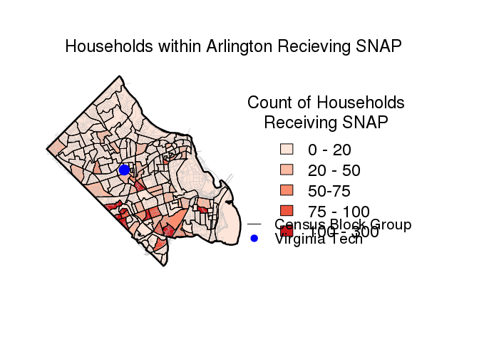
par(mai = c(1, 0, 1, 2.8))
plot(geodat, col = colcode)
# Add title
mtext("Households within Arlington Recieving SNAP", 3, line = 1, cex = 1.5,
adj = -1.3)
# add = TRUE to add another layer to the same plot
plot(Roads, add = TRUE, col = "grey", lwd = 0.3)
plot(geodat, add = TRUE, lwd = 1)
plot(Ar, add = TRUE, lwd = 2.5)
plot(VT, add = TRUE, pch = 19, cex = 2, col = "blue")
legend(-77.03, 38.91635, xpd = TRUE, legend = names, fill = attr(colcode, "palette"),
cex = 1.5, bty = "n", title = "Count of Households\nReceiving SNAP")
legend(-77.03, 38.86, c("Census Block Group", "Virginia Tech"), lty = c(1, -1),
pch = c(-1, 19), col = c("black", "blue"), cex = 1.3, , seg.len = 1, y.intersp = 0.8,
bty = "n", xpd = TRUE)
# spplot ------------------------------------------------------------------

spplot(geodat,"snap")
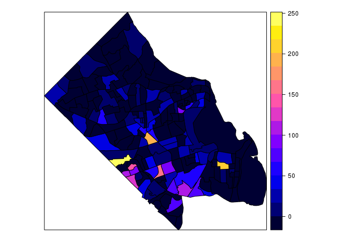
##this is ugly, let's chose our own colors
# Choose own colors
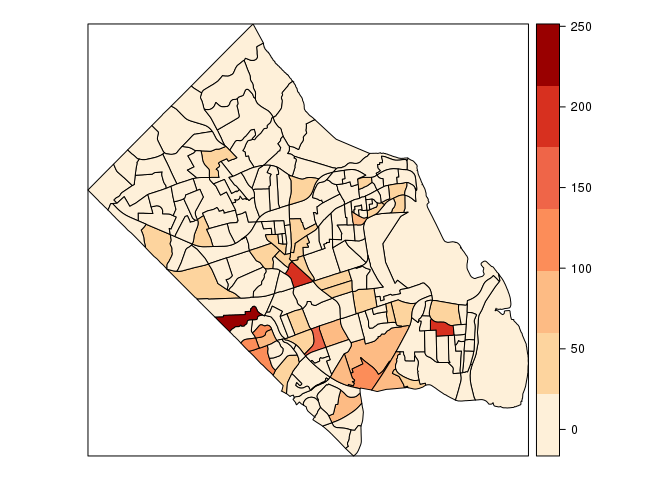
pal <- brewer.pal(7, "OrRd") # select 7 colors from the palette OrRd
# Number of colors should be one higher than number of cuts
spplot(geodat, "snap", col.regions = pal, cuts = 6)
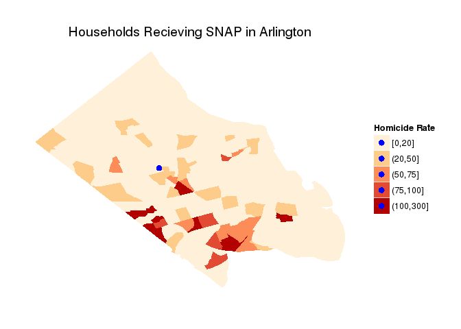
# ggplot and hexbins ------------------------------------------------------
# create a unique ID for the later join
geodat@data$id = rownames(geodat@data)
# turn SpatialPolygonsDataframe into a data.frame
geodat.pts <- fortify(geodat, region="id") # Only has the coordinates
geodat.df <- left_join(geodat.pts, geodat@data, by="id") # Add the attributes back in
# calculate quantile breaks
geodat.df$qt <- cut(geodat.df$snap,
breaks = c(0,20,50,75,100,300),include.lowest = TRUE)
# Make VT into a data.frame
VT<-as.data.frame(VT)
# plot
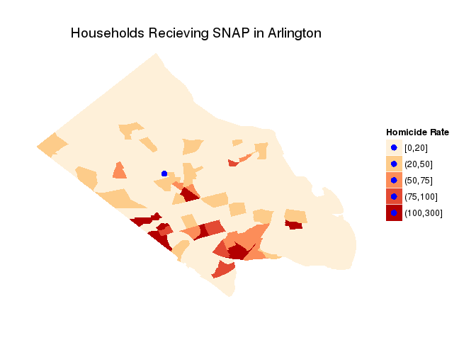
ggplot(geodat.df, aes(long,lat,group=group, fill=qt)) + # the data
ggtitle("Households Recieving SNAP in Arlington") +
geom_polygon() + # make polygons
scale_fill_brewer("Homicide Rate", palette = "OrRd") + # fill with brewer colors
theme(line = element_blank(), # remove the background, tickmarks, etc
axis.text=element_blank(),
axis.title=element_blank(),
panel.background = element_blank()) +
geom_point(aes(x, y,fill = NULL,group = NULL), size = 3,data=VT,col="blue")+
scale_alpha(guide = 'none')+
coord_equal()
# spplot ------------------------------------------------------------------

spplot(geodat, "snap")

## this is ugly, let's chose our own colors

# Choose own colors
pal <- brewer.pal(7, "OrRd")  # select 7 colors from the palette OrRd
# Number of colors should be one higher than number of cuts
spplot(geodat, "snap", col.regions = pal, cuts = 6)

# ggplot and hexbins ------------------------------------------------------

# create a unique ID for the later join
geodat@data$id = rownames(geodat@data)

# turn SpatialPolygonsDataframe into a data.frame
geodat.pts <- fortify(geodat, region = "id")  # Only has the coordinates
geodat.df <- left_join(geodat.pts, geodat@data, by = "id")  # Add the attributes back in

# calculate quantile breaks
geodat.df$qt <- cut(geodat.df$snap, breaks = c(0, 20, 50, 75, 100, 300), include.lowest = TRUE)

# Make VT into a data.frame
VT <- as.data.frame(VT)
# plot
ggplot(geodat.df, aes(long, lat, group = group, fill = qt)) +
  ggtitle("Households Recieving SNAP in Arlington") +
  geom_polygon() + # make polygons
  scale_fill_brewer("Homicide Rate", palette = "OrRd") + # fill with brewer colors
  theme(line = element_blank(),  # remove the background, tickmarks, etc
        axis.text = element_blank(),
        axis.title = element_blank(),
        panel.background = element_blank()) +
  geom_point(aes(x, y, fill = NULL, group = NULL),
             size = 3, data = VT, col = "blue") +
  scale_alpha(guide = 'none') +
  coord_equal()
Example 2: Philly
# Example 2: Philly ------------------------

# Load Data ---------------------------------------------------------------

# Philly Shapefile

philly <- readShapePoly("Data/Philly2/Philly2.shp")

# N_HOMIC: Number of homicides (since 2006)
# HOMIC_R: homicide rate per 100,000 (Philadelphia Open Data)
# PCT_COL: % 25 years and older with college or higher degree1 (ACS 2006-2010)
# mdHHnc: estimated median household income (ACS 2006-2010)

# spplot ------------------------------------------------------------------

spplot(philly) # sp plot (general)

spplot(philly, c("HOMIC_R", "PCT_COL")) # Just those
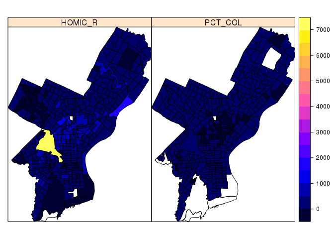
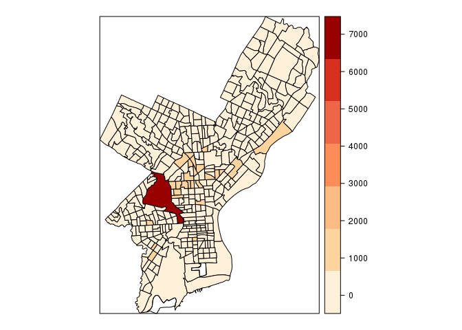
# Using color.brewer
pal <- brewer.pal(7, "OrRd")  # we select 7 colors from the palette
spplot(philly, "HOMIC_R", col.regions = pal, cuts = 6)
# ggplot hexbins ------------------------------------------------------

homicides<-read.csv("PhillyHomicides.csv")
head(homicides) # X and Y at end are coordinates
  DC_DIST SECTOR  DISPATCH_DATE_TIME DISPATCH_DATE DISPATCH_TIME HOUR
1      22      1 2014-09-14 16:00:00    2014-09-14      16:00:00   NA
2       1      B 2006-01-14 00:00:00    2006-01-14      00:00:00   NA
3       1      B 2006-04-01 16:05:00    2006-04-01      16:05:00   NA
4       1      B 2006-05-10 11:13:00    2006-05-10      11:13:00   NA
5       1      E 2006-07-01 12:42:00    2006-07-01      12:42:00   NA
6       1      F 2006-07-09 19:13:00    2006-07-09      19:13:00   NA
        DC_KEY          LOCATION_BLOCK UCR_GENERAL OBJECTID
1 199822061421 1800 BLOCK W MONTGOMERY         100 44774978
2 200601001669   2000 BLOCK MIFFLIN ST         100 44746630
3 200601011408   S 22ND ST /SNYDER AVE         100 44746625
4 200601016399   2100 BLOCK MC KEAN ST         100 44771721
5 200601023411   2100 BLOCK S HICKS ST         100 44746632
6 200601024451   1800 BLOCK SNYDER AVE         100 44843467
     TEXT_GENERAL_CODE   POINT_X  POINT_Y    SHAPE
1  Homicide - Criminal -75.15680 39.98804 44714107
2  Homicide - Criminal -75.17873 39.92801 44685759
3  Homicide - Criminal -75.18275 39.92607 44685754
4  Homicide - Criminal -75.18092 39.92704 44710850
5  Homicide - Criminal -75.17204 39.92463 44685761
6 Homicide - Criminal  -75.17612 39.92517 44782596
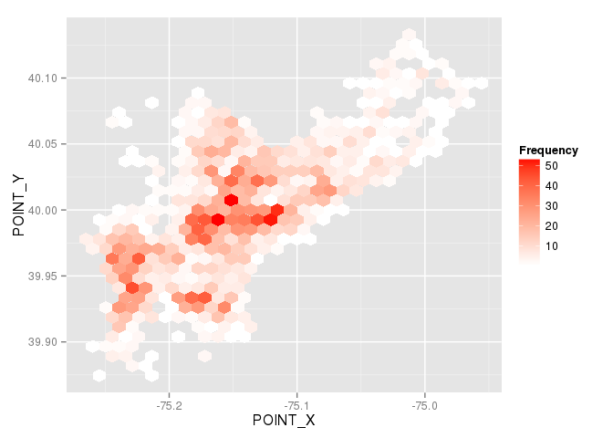
ggplot(homicides, aes(POINT_X, POINT_Y)) +
    stat_binhex() +
    scale_fill_gradientn(colours = c("white", "red"), name = "Frequency")
# ggplot ------------------------------------------------------
# create a unique ID for the later join
philly@data$id = rownames(philly@data)
# turn SpatialPolygonsDataframe into a data frame
philly.pts <- fortify(philly, region="id") #this only has the coordinates
philly.df <- left_join(philly.pts, philly@data, by="id") # add the attributes back in
# calculate quantile breaks
philly.df$qt <- cut(philly.df$HOMIC_R,
breaks = quantile(philly.df$HOMIC_R, probs = 0:7/7, na.rm = TRUE),
include.lowest = TRUE)
# plot
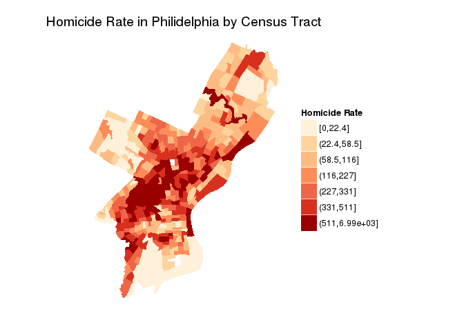
ggplot(philly.df, aes(long,lat,group=group, fill=qt)) + # the data
ggtitle("Homicide Rate in Philidelphia by Census Tract") +
geom_polygon() + # make polygons
scale_fill_brewer("Homicide Rate", palette = "OrRd") + # fill with brewer colors
theme(line = element_blank(), # remove the background, tickmarks, etc
axis.text=element_blank(),
axis.title=element_blank(),
panel.background = element_blank()) +
coord_equal()
# Event Data with Coordinates ---------------------------------------------
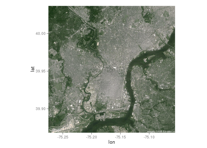
# Basemap
phBasemap <- get_map(location="Philadelphia, PA", zoom=12, maptype = 'satellite')
ggmap(phBasemap)
# Try out these different backgrounds (see library information)
#phBasemap <- get_map(location="Philadelphia, PA", zoom=12, maptype = 'terrain')
#ggmap(phBasemap)
#phBasemap <- get_map(location="Philadelphia, PA", zoom=12, maptype = 'toner')
#ggmap(phBasemap)
#phBasemap <- get_map(location="Philadelphia, PA", zoom=12, maptype = 'watercolor')
#ggmap(phBasemap)
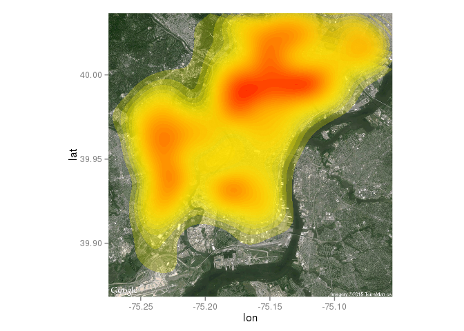
# plot with heatmap
ggmap(phBasemap) +
# make the heatmap
stat_density2d(aes(x = POINT_X,
y = POINT_Y,
fill = ..level.., # value corresponding to discretized density estimates
alpha = ..level..),
bins = 25, # number of bands
data = homicides,
geom = "polygon") + # creates the bands of differenc dolors
## Configure the colors, transparency and panel
scale_fill_gradient(low = "yellow", high = "red") +
scale_alpha(range = c(.25, .55)) +
theme(legend.position="none")
Example 3: Web Scrapping
# Example 3: Web Scrapping ------------------------------------------------
# read in the data
url <- "http://en.wikipedia.org/wiki/List_of_United_States_cities_by_crime_rate"
# we want the first table: which=1
citiesCR <- readHTMLTable(url, which = 1, stringsAsFactors = FALSE)
# clean up (with mutate_each function from dplyr): remove the comma in 1,000
# and above and convert numbers from strings to numeric
citiesCRclean <- mutate_each(citiesCR, funs(as.numeric(gsub(",", "", .))), -(State:City))
# geocode loations
latlon <- geocode(paste(citiesCRclean$City, citiesCRclean$State, sep = ", "))
# combine into a new dataframe
citiesCRll <- data.frame(citiesCRclean, latlon)
# get basmap
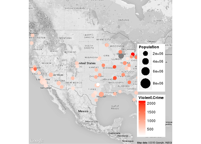
map_us <- get_map(location = "United States", zoom = 4, color = "bw")
# plot
ggmap(map_us, legend = "bottomright", extent = "device") + geom_point(data = citiesCRll,
aes(x = lon, y = lat, color = Violent.Crime, size = Population)) + scale_colour_gradient(low = "white",
high = "red") + scale_size_continuous(range = c(4, 12))